SABE
ACCESSORies
ACCESORIES RETAIL
logo | visual identity
website | EDITORIAL
BRAND ENVIRONMENT
2018
Accessories encompass objects crafted to elevate the functionality, adaptability, or allure of another item. Within the realm of fashion, these accessories complement the wearer's attire, thoughtfully chosen to synchronize seamlessly with their overall appearance.
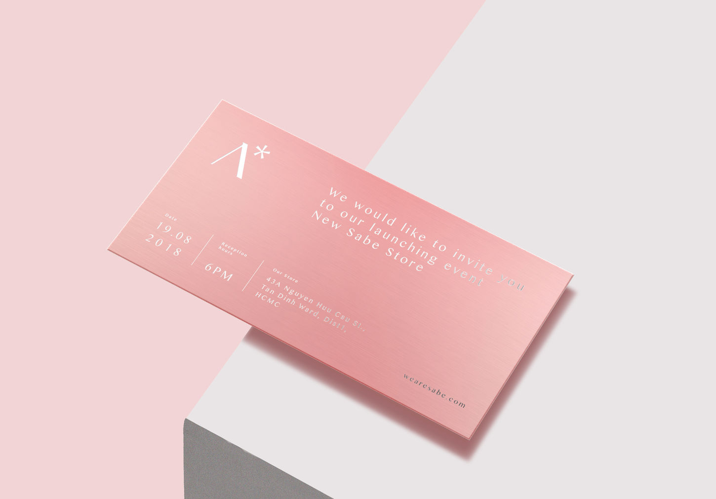
Sabe, an accessory brand located in Ho Chi Minh City, aspires to establish a distinctive identity. The brand's logo incorporates the letter 'A,' representing 'Accessory,' accompanied by an asterisk that signifies a rising star—a simple yet potent emblem that embodies the notion of complementation.
The essence of Sabe's identity revolves around elegance and minimalism, perfectly aligned with their motto, 'We believe in small details.' Their tone and communication style focus on fortifying the connection between accessories and the wearer. The brand's color palette, consisting of pink and red, permeates all brand applications and imagery.
Currently maintaining three physical stores in Ho Chi Minh City, Sabe has ambitious plans to expand its operations into the realm of online shopping, encompassing an e-commerce website and an active Instagram presence.

Credits:
A work for ©SABE
Creative Direction & Brand Identity: Tess Pham
Art Direction: Tess Pham
Concept Pop Up Store: Tess Pham & SpaceFrom Visual
Model: Minh Thanh Luu
Visualization: ©SpaceFrom Visual


